Zcash + Electric Coin Co.
Refining Zcash and building a distinct brand for Electric Coin Co.
Zcash is a digital currency designed around privacy. Electric Coin Co. is the company that created it and continued to support its development. The currency and company shared a mission, while each needed an identity suited to its own role.
Our work at Adjy began with a refresh of the Zcash brand. The relationship grew to include the development of Electric Coin Co.’s identity and ongoing support for both brands.
My role was lead art director and primary designer on the account. I worked with our Creative Director, writers and the client team to develop visual directions and carry the work through design and production.
Building on an existing identity
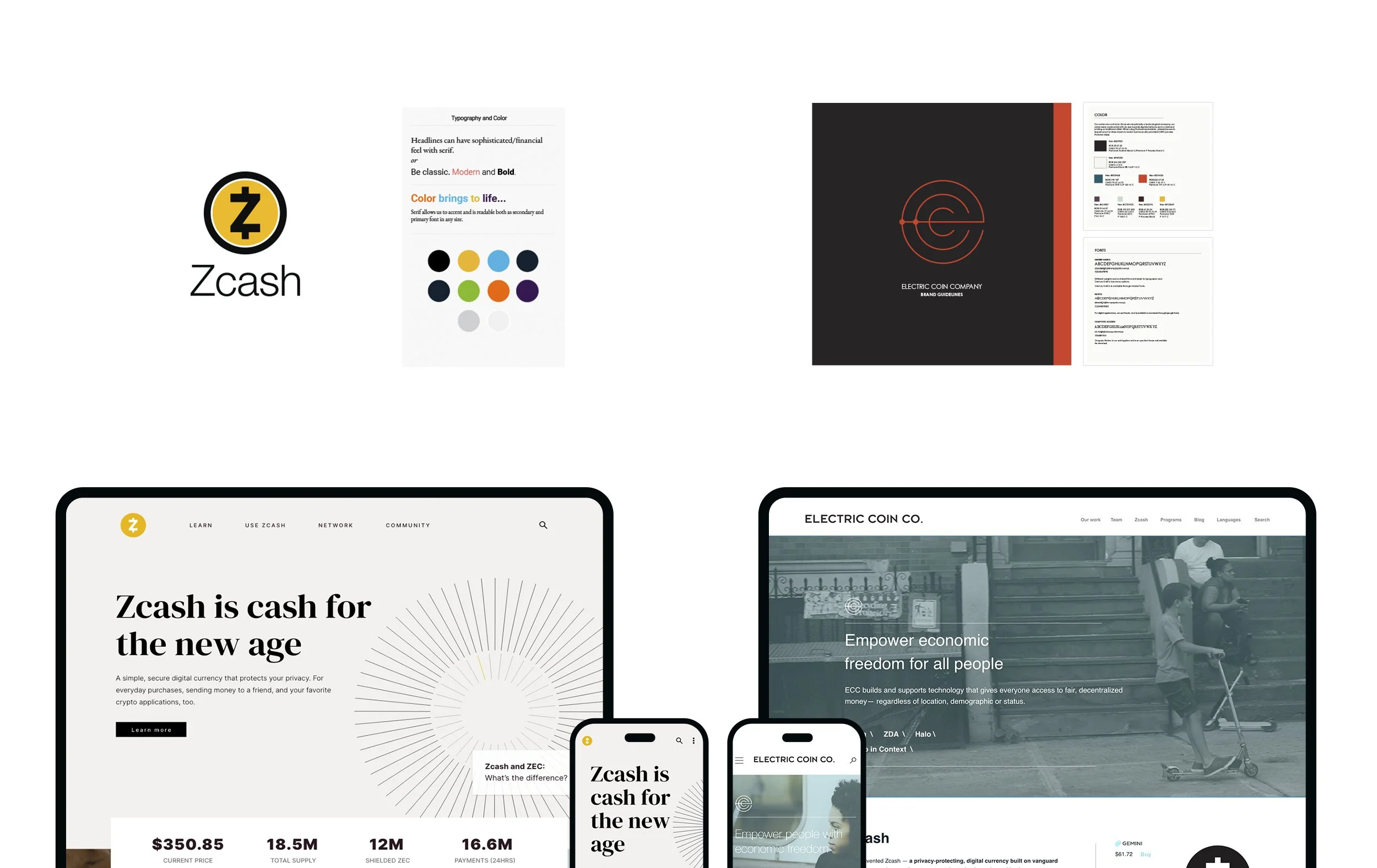
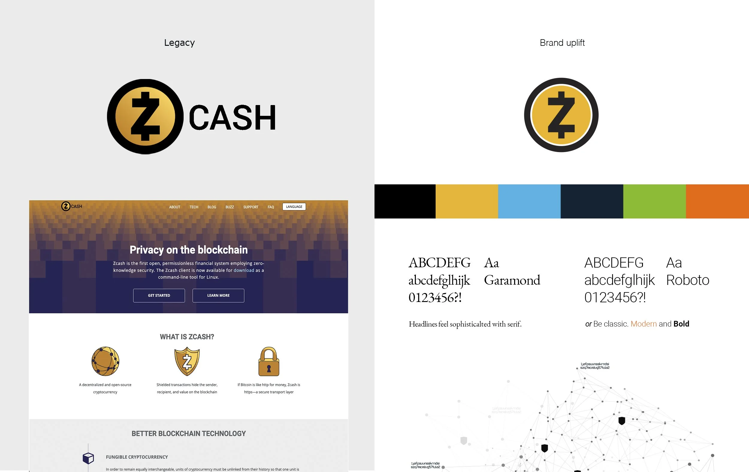
The established Zcash mark gave us a recognizable starting point. We refined its proportions and wordmark relationship, then expanded the supporting visual language. Gold remained central to the identity, with typography, additional colors and imagery giving the brand more flexibility.
A clearer introduction
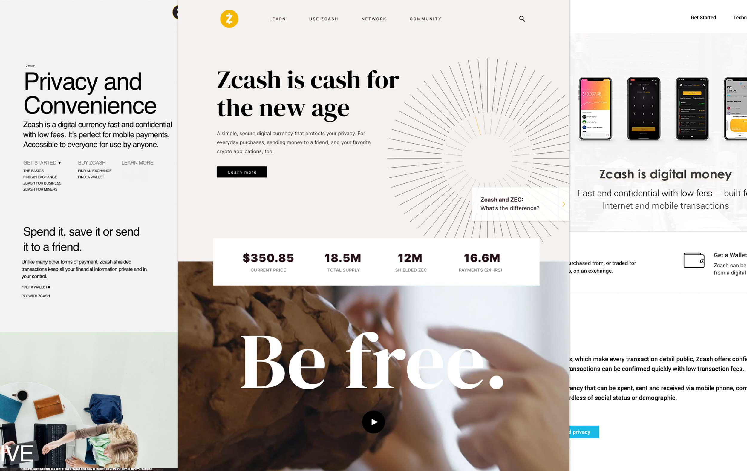
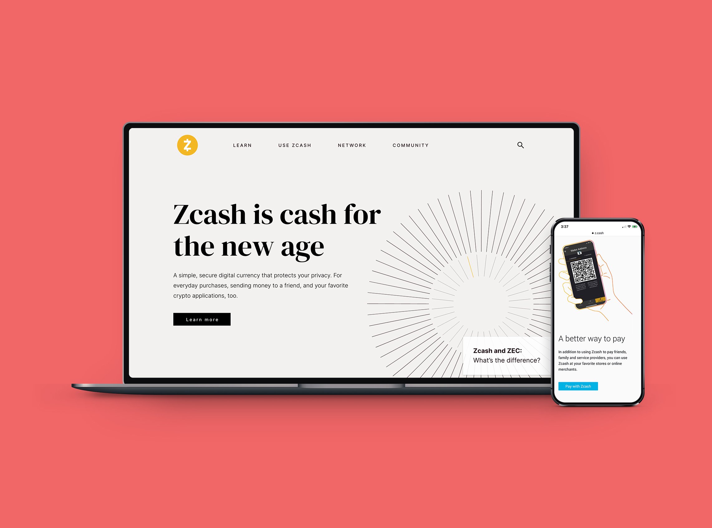
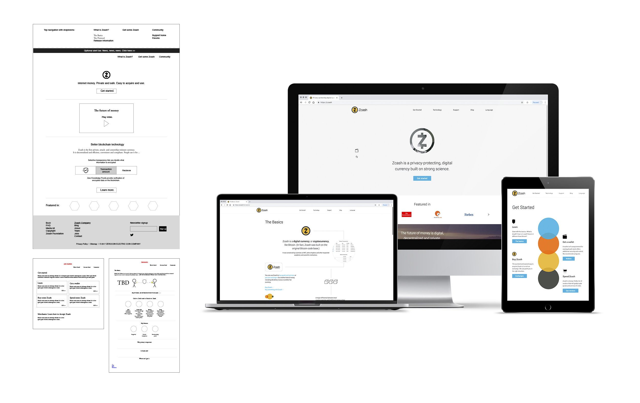
The website translated the refreshed brand into a more accessible introduction to Zcash and helped distinguish Zcash from the gradient and illustration driven identities that were flooding the landscape. We organized information for people discovering the currency, alongside resources for more knowledgeable visitors. I designed the site with our content and their development team, taking it through its October 2018 launch.

Putting the brand to work
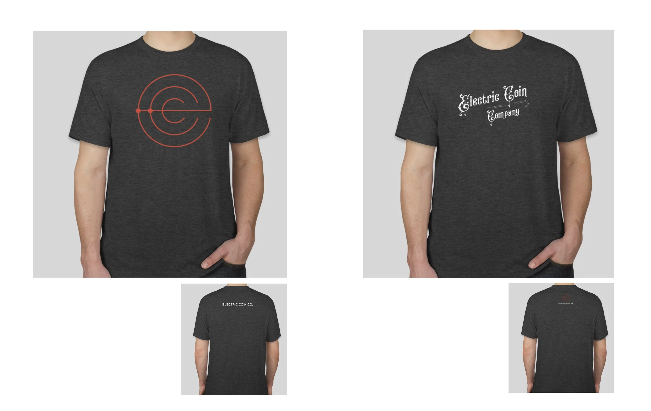
Sapling gave us the first major opportunity to apply the refreshed identity to a release campaign. Countdown graphics and merchandise shared a consistent visual direction. That work developed into continued support across social, editorial and educational communications, with motion extending the system further.

Creating a distinct identity for ECC
The Zcash Company’s move to the Electric Coin Co. name called for a brand that represented the organization itself. Its work included research and engineering, alongside education and advocacy for economic freedom.
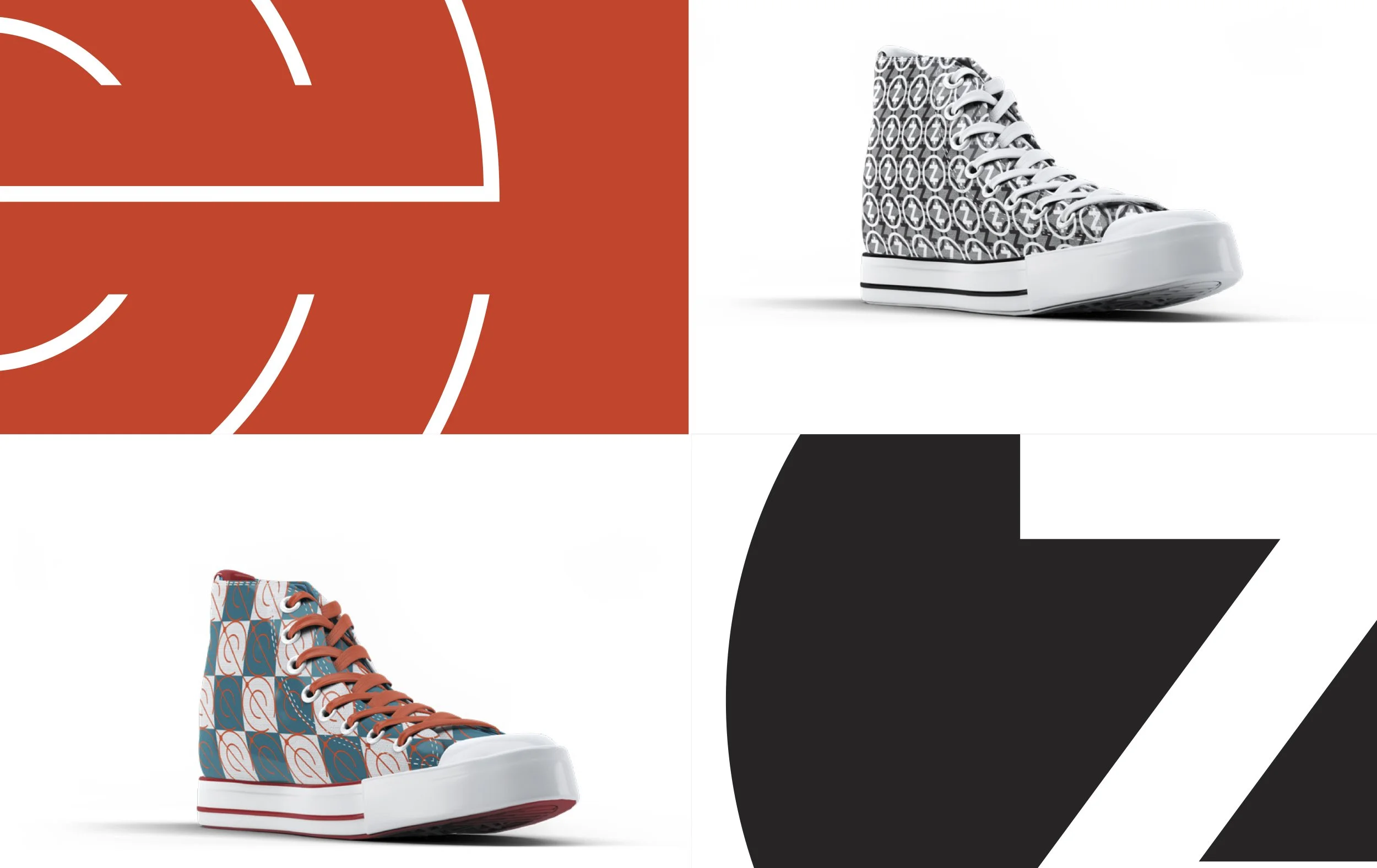
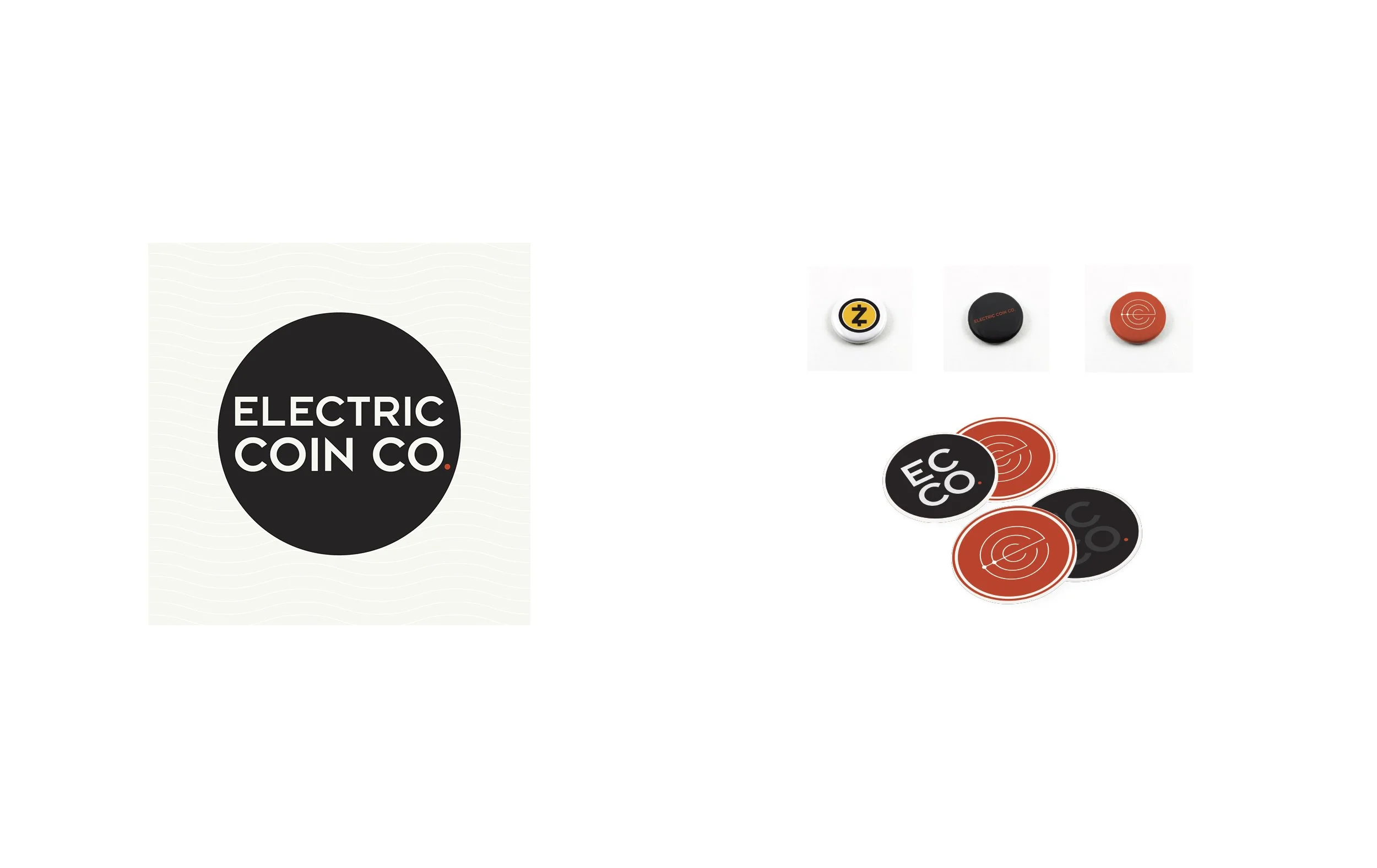
I helped develop the new identity and carry it into a practical visual system. ECC’s circular symbol and orange accent gave it a presence distinct from Zcash’s gold. The symbol’s linework could become a pattern or extend across a layout, giving us a graphic language to build upon. Typography, supporting colors and usage guidelines helped keep those applications connected.
Giving the mission a visual direction
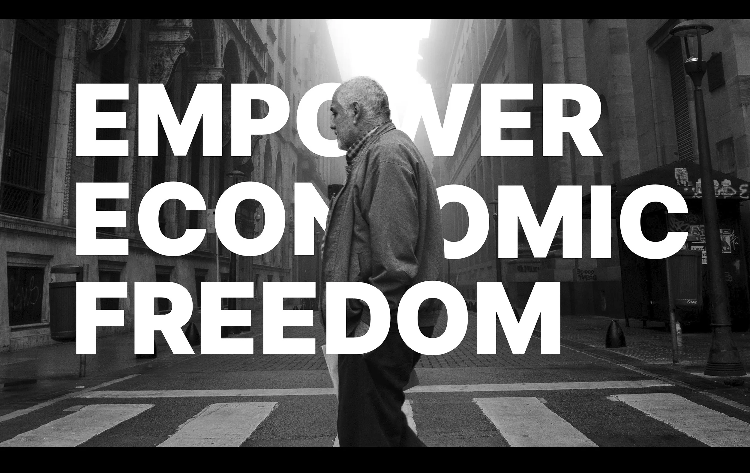
ECC’s mission gave the identity a broader subject than the currency alone. Its communications needed to connect technical work with the people and circumstances that made economic freedom matter.
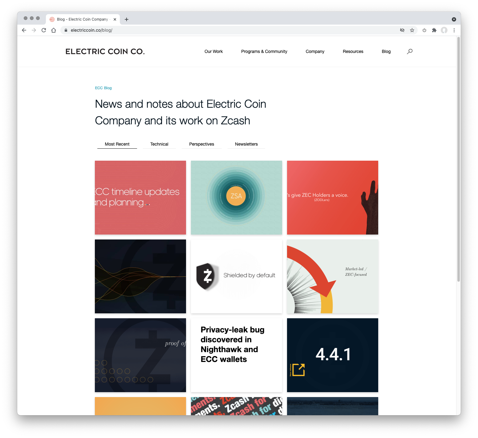
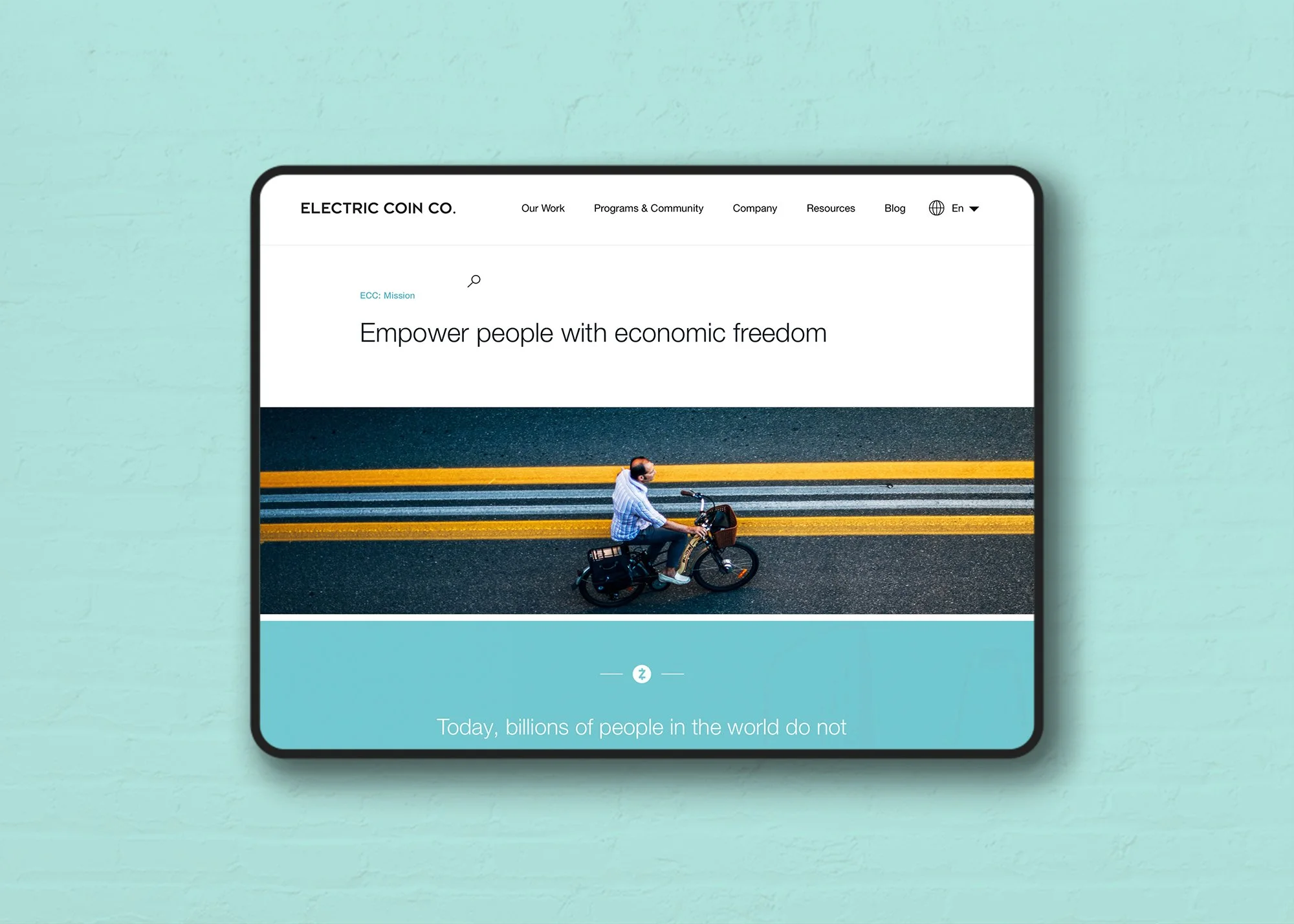
I carried that direction into the company’s website and supporting materials. Photography brought a human perspective, while typography and color helped organize content ranging from the mission to technical updates and community programs. The site gave ECC a place to explain its own work and its relationship to Zcash.
Extending the identity into editorial and print
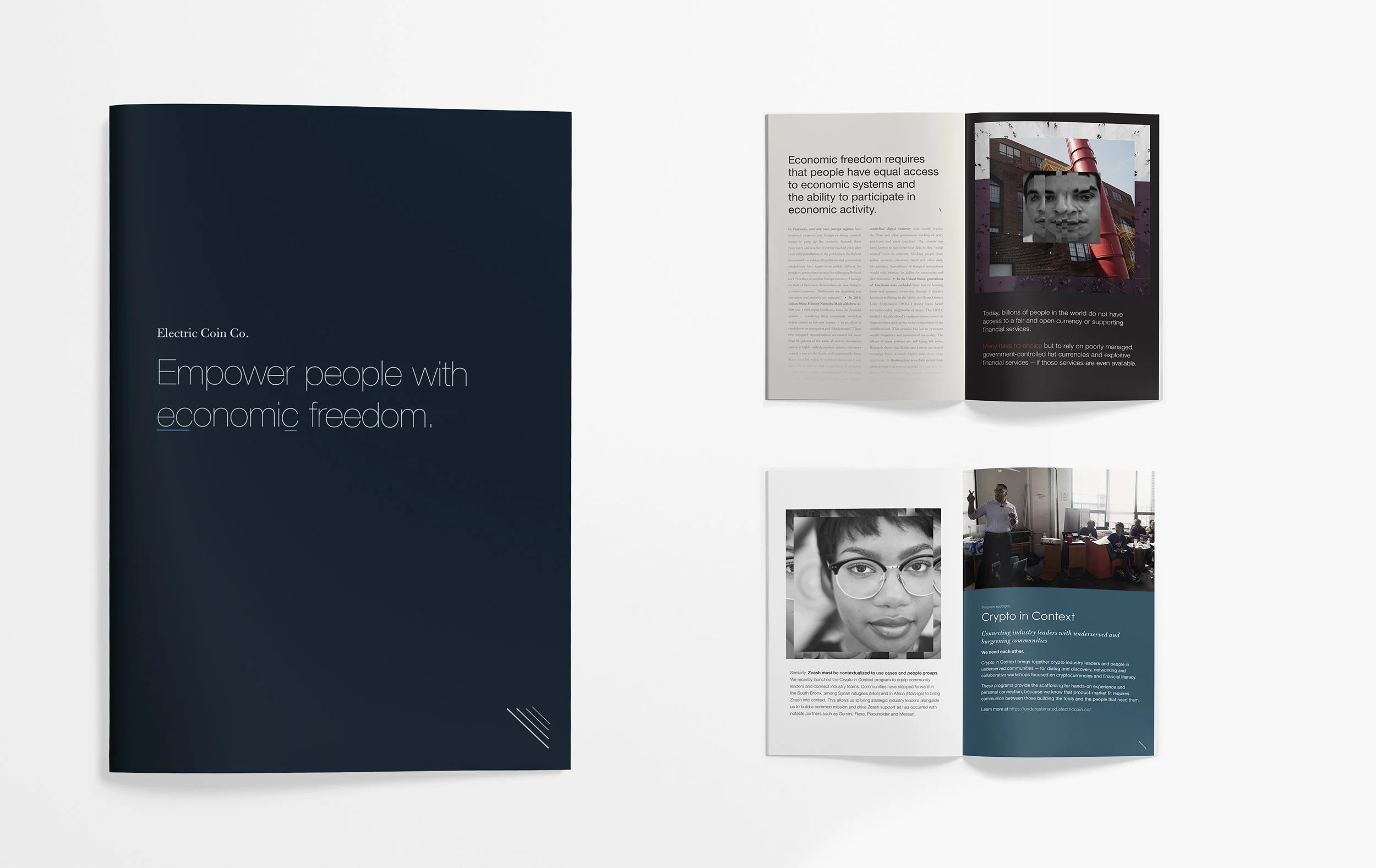
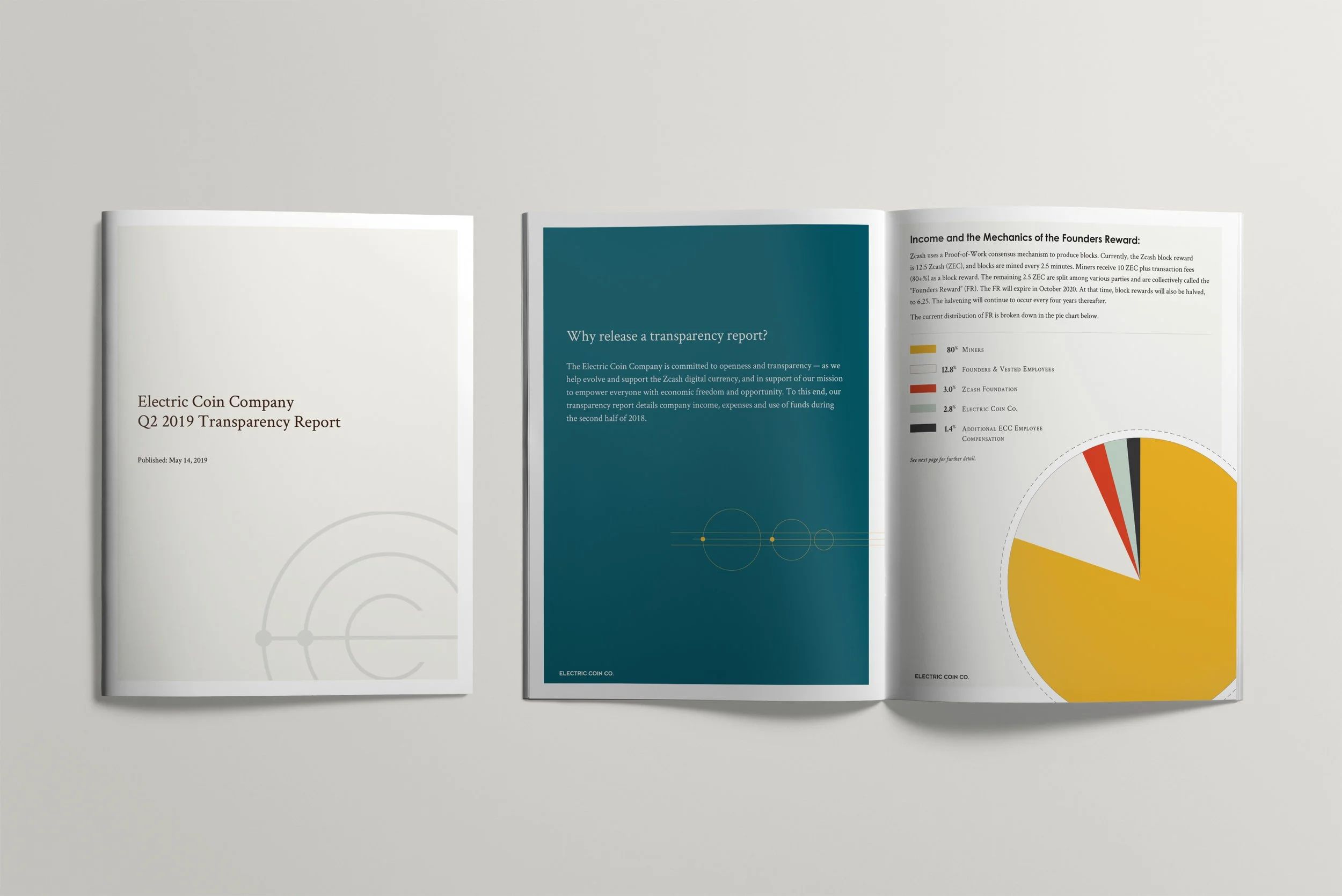
The system also had to support communications with very different purposes. A mission publication used photography and editorial layouts to introduce ECC’s perspective on economic freedom. Transparency reports called for clear information hierarchy and charts.
I extended the identity across those materials, adjusting the balance of typography, imagery and color to suit the content. The same brand could support a more expressive introduction to the company and the practical detail of a report.
Evolving the brands over time
Later Zcash websites put more emphasis on practical use, including finding a wallet and understanding private payments. As the relationship continued, I refined both brands across new projects and recurring communications, maintaining their individual identities as the work changed.