Zcash Brand evolution
Making privacy easier to understand
Zcash launched in 2016 with a strong scientific foundation and an audience that understood the technology. As it grew, the brand needed to reach people with different levels of familiarity with cryptocurrency, from prospective users to press, partners and potential employees.
At Adjy, we began by refreshing the identity and helping clarify the messaging. That became an ongoing relationship spanning websites, campaigns, motion and everyday brand communication.
I was the lead art director and primary designer, working closely with our creative director and the Zcash team to develop the visual direction and carry it through production.
Building on an existing identity
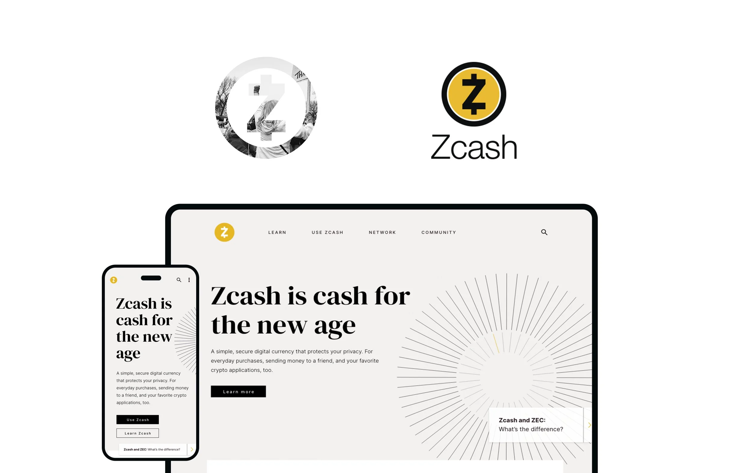
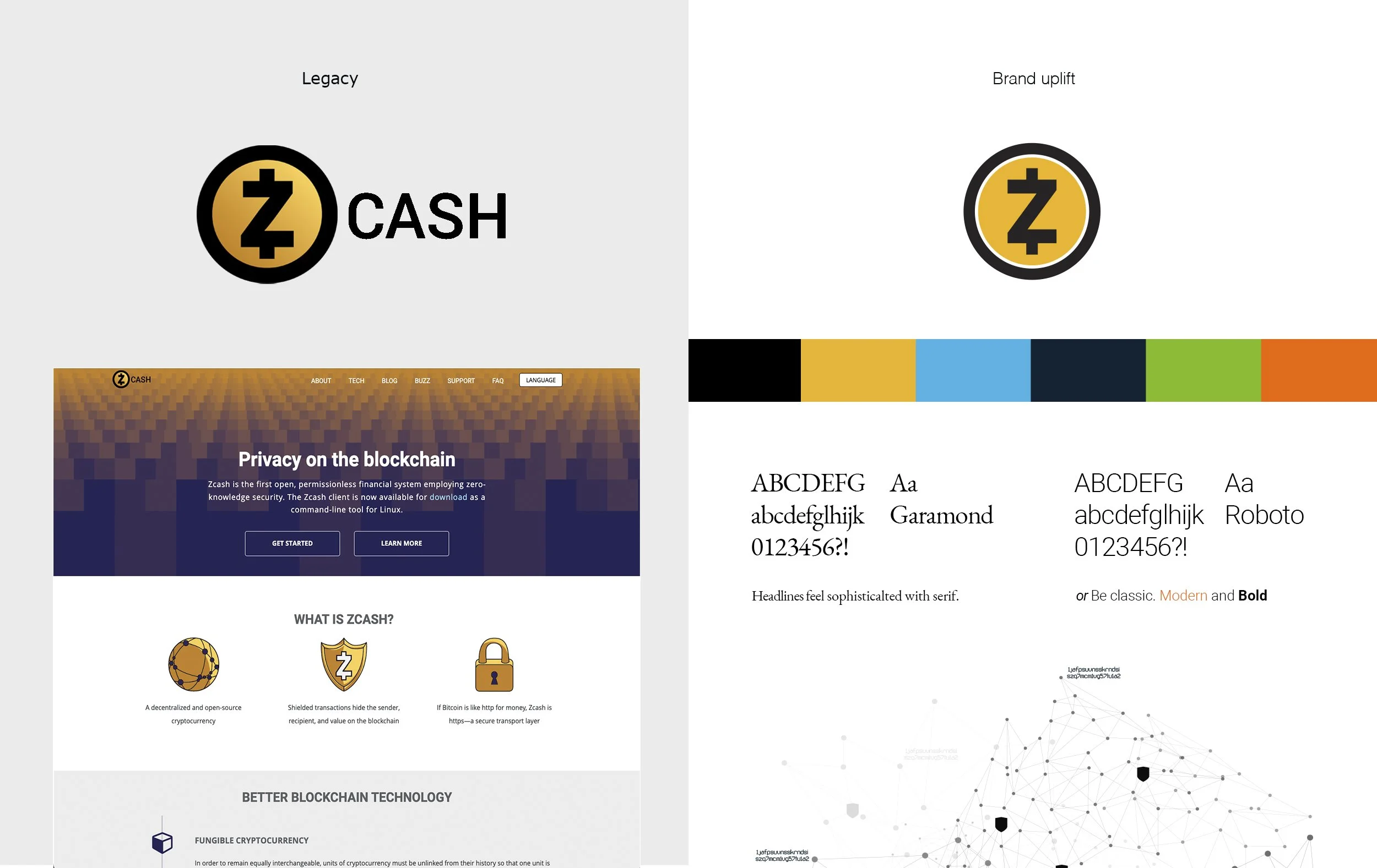
The Zcash symbol was already established. Our work began with refining the coin mark and its relationship to the wordmark, then developing a broader visual language around it.
Gold remained a recognizable part of the identity. Typography, supporting colors and a more flexible approach regarding imagery gave us room to communicate across different subjects and formats. The system needed to support technical explanations while also making privacy feel relevant to everyday life.
A clearer introduction
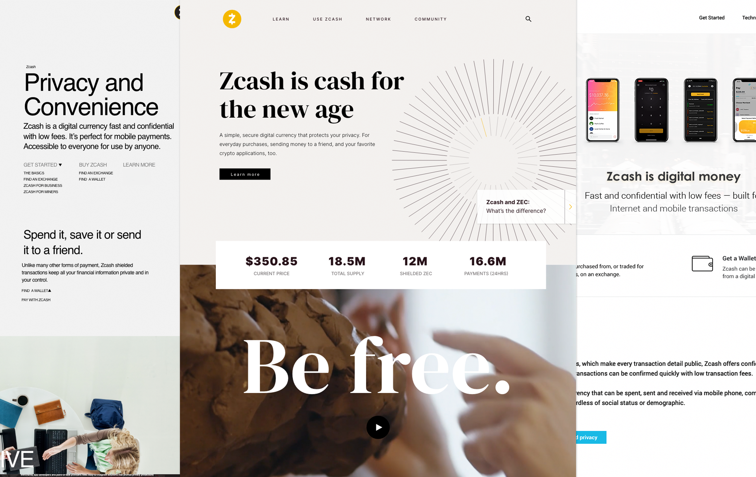
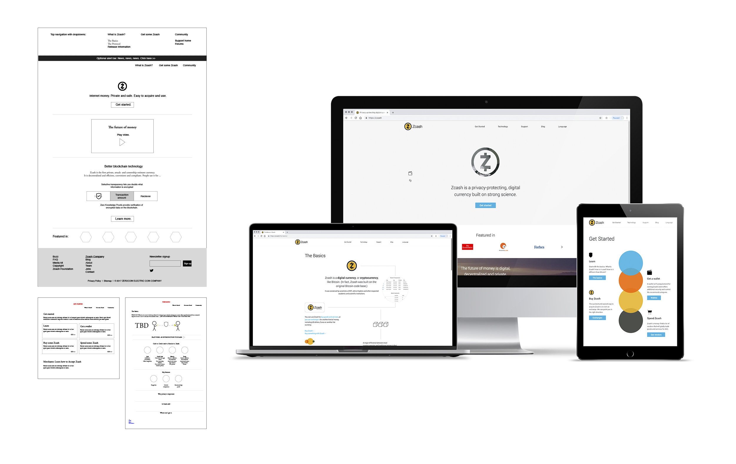
The website brought the refreshed identity and messaging together. Zcash already had substantial technical information; the challenge was helping visitors find an appropriate starting point.
We organized the experience around what people wanted to understand or do, giving newcomers a clearer introduction while preserving access to deeper resources. I designed the website and worked with our content and development teams to bring it through launch in October 2018.
Shortly afterward, Adjy became the Zcash Company’s agency of record.

Putting the brand to work
Sapling was our first major push following the refresh. The release gave us an early opportunity to extend the system into a coordinated set of communications, including countdown graphics and promotional merchandise.
The work continued across educational content, editorial graphics, social campaigns and motion. Each piece had a different purpose, but the underlying task stayed consistent: explain the subject clearly and give it a recognizable place within the brand.

Evolving with Zcash
The identity and website continued to evolve as the currency, its audience and the surrounding ecosystem changed.
Later website iterations put greater emphasis on practical use: finding a wallet, acquiring Zcash and understanding how private digital payments work. The visual direction also developed, introducing stronger editorial typography and a broader role for photography and motion.