PRIVACY IS NORMAL
Campaign, typography, poster series, merchandise
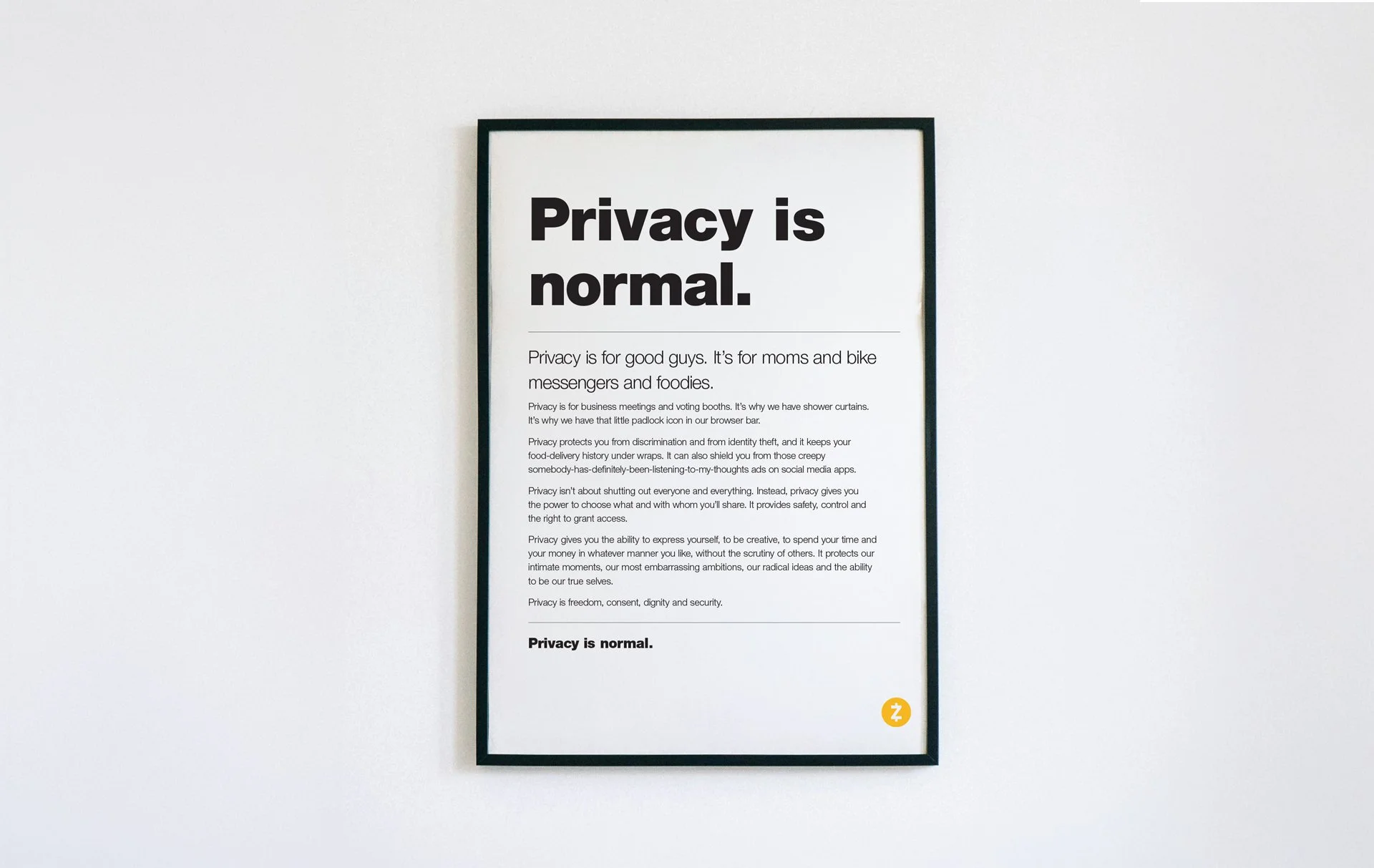
Privacy is ordinary — shower curtains, voting booths, the padlock in the browser bar — and most of it was given away without anyone deciding to. This was a reminder, not a warning. The campaign treated privacy in the same way: as something normal and expected rather than technical or abstract.
Our creative director wrote the manifesto: privacy is a right we've quietly handed over, and asking for it back isn't alarmism. I developed the visual system around it, beginning with the typography and original poster. It had to look direct rather than decorative.
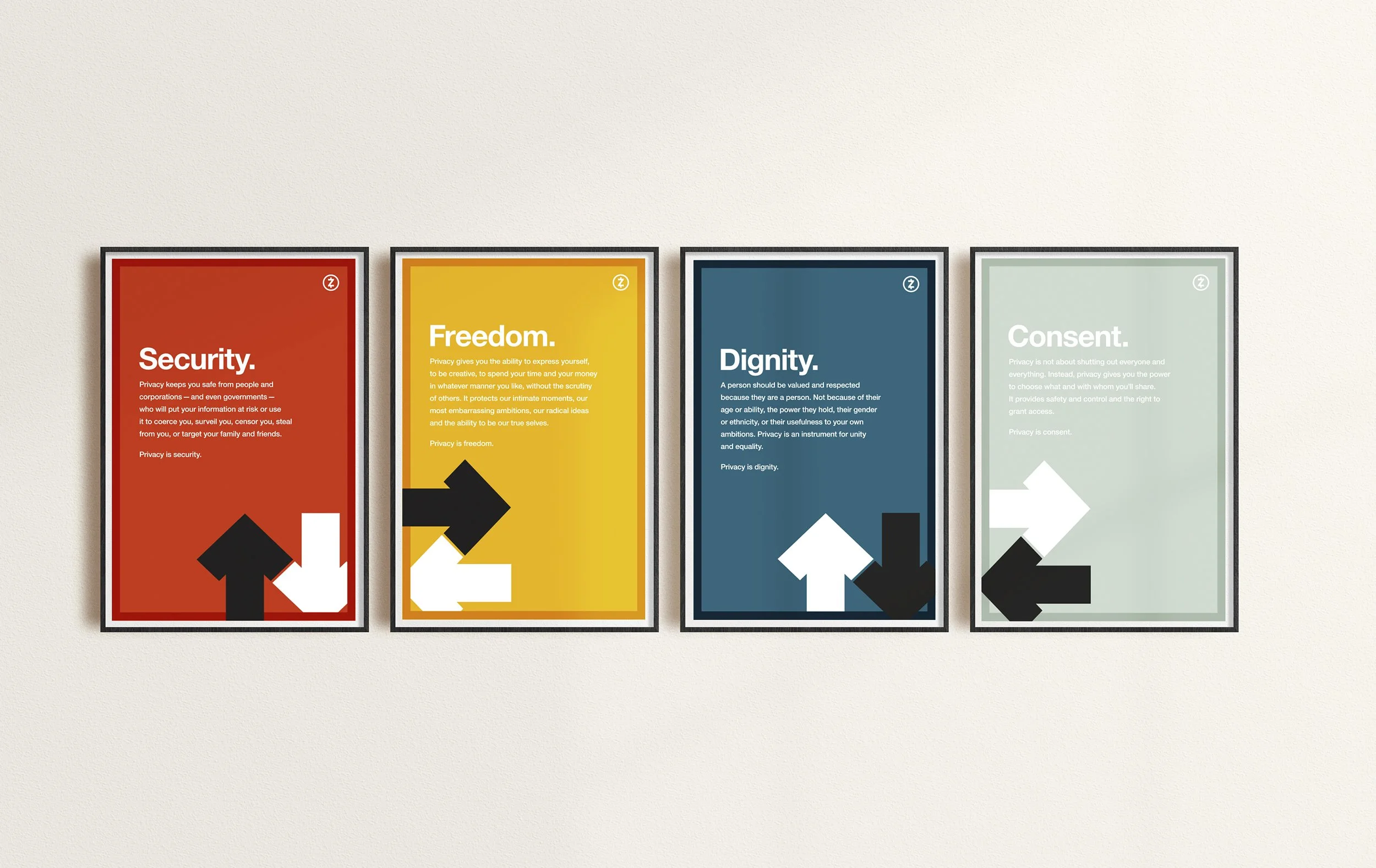
The poster worked, so we expanded it. The series takes the four words the manifesto closes on — freedom, consent, dignity, security — one principle per poster. Every principle involves a give and a take, and none of them requires giving all of it away.
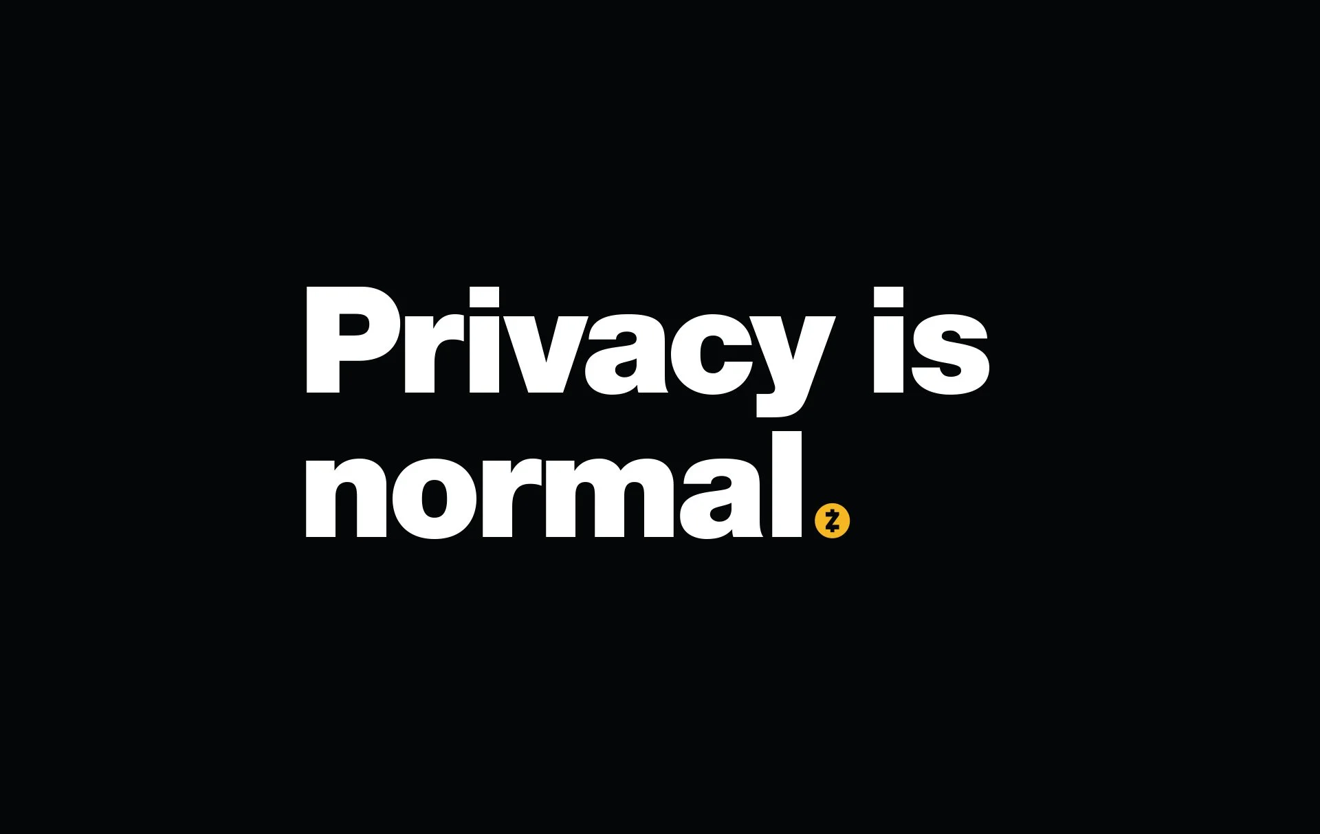
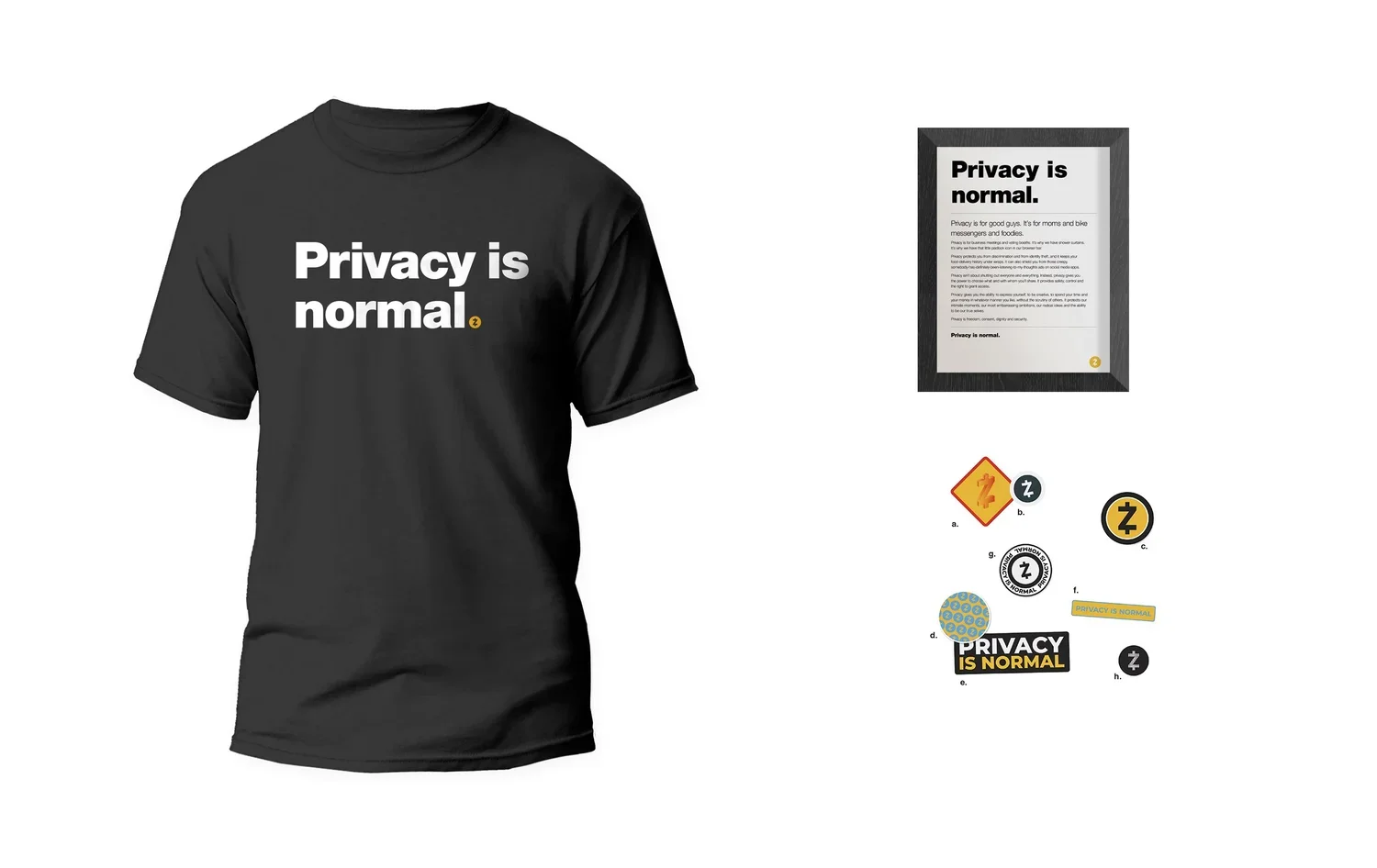
The environmental work kept the same restraint. Crypto marketing was full of gradients, glow effects and dense digital imagery. We stayed with Helvetica, flat color and a small graphic vocabulary. At a larger scale, the campaign still felt like the same straightforward statement.